SwyxIt! Classic offers you the option of changing existing buttons or icon buttons, and adding or deleting buttons and/or icons.
Configuring a Button
With SwyxIt! Classic you can change the appearance and function of every individual button. A button is made up of the following changeable components:
Key function (type)
button background image
button state
Image or animation, which indicates the respective state of the button
This tab helps you to define the general settings for the button.
To define the general settings for a button
1 Click on "Type" on the button type (function).
2 Enter the text to be used for the label of the button in the “Name” field. You can only change the label for Speed Dial buttons, Line Buttons, and Shortcuts within the configuration of the normal mode, which means after leaving the editing mode.
3 Click on ”Default” to use a possible default text (standard) as the name for the button type selected in ”Type”.
4 Enter a specific number in the “Number” field for Line, Shortcut, and Speed Dial buttons.
If you have copied a speed dial button, you will be able to dial the same destination from both buttons. If you would like to have two buttons, which are assigned with different destinations, then you must give the buttons different numbers. Only then can you assign different Speed Dials to both buttons in the normal mode.
5 The checkbox “Indexed area” indicates that this button type is indexed. It is then possible to assign your own information area to this index. This option is only relevant for line buttons.
Example:
You have a button “Line 1” and a button “Line 2”. You can later add an information area, which is only assigned to Line 1. Here you can display e.g. the call history. This allows you to illustrate the execution of a call and the various connection attempts.
6 Activate the checkbox “Show Text” if you would like to label the button with the text entered under “Name”. The position, color, and font of the text is set on the “Text Style” tab.
7 Activate the checkbox “Enable User Bitmap” so that it is possible for the user to define an image after leaving the Edit Mode. This option is only available for Speed Dials and Shortcut buttons.
8 You define the graphic file which you would like to use for the button background, under “Background image” in the “Normal” field:
Click on to search for the appropriate files or
Click on to edit the selected graphic using the linked graphic application.
You must always specify a background image in the "Normal" field. If you leave this field blank, an error message will be displayed when you close the tab.
Define further background images if necessary for specific states of the relevant button.
"Selected" field: The graphic file to be used instead of the normal button background image when this button is active. This option is only available for line buttons and tab elements.
Deactivated: The graphic file to be used instead of the normal button background image when this button is not active.
Clicked: The graphic file to be used instead of the normal button background image when this button is clicked.
MouseOver: The graphic file to be used instead of the normal button background image when the mouse pointer is moved over this button.
If you do not specify a background image for a particular state, the graphic given in the "Normal" field is used.
You can define further background images for button-specific states on the "States" tab.
For formats that don't support transparency, the color of the upper left pixel of the graphic is interpreted as a transparent color. This means that the background graphic of the Skin will show through in all areas of the button background in which this color occurs.
9 The coordinates of the button within the SwyxIt! Classic interface can be defined under “Position” in the “x-Axis” and “y-Axis” fields. The zero point of the coordinate system lies in the upper left corner.
The “States” Tab
Each button can take on different states depending on its type. The button can be assigned an image (BMP file) or an animation (AVI file) for each of these states.
To define the state properties for a button
1 Open “State” and click on the “Name” drop-down list.
Here you will find a list of all the available states according to the type of the button.
The following states are available for a Line Button
“Idle”
“Dial”,
“Busy”
Some states may include placeholders. In this case, %peeraddress% represents the name of the caller and %calledaddress% represents the name of the subscriber called.
2 The graphic file or the AVI animation to be used for the button state is defined in the field “State Image”.
Click on to search for the appropriate files or
Click on to edit the selected graphic using the linked graphic application.
If no state image was specified for a particular state, the background image is displayed.
For formats that don't support transparency, the color of the upper left pixel of the graphic, or of the same pixel of the first graphic in the AVI animation, will be interpreted as a transparent color. This means that the button background graphic and/or the background graphic of the Skin will show through in all areas of the state image in which this color occurs.
3 Enter a short help text for the QuickInfo in the ”Description” field. This QuickInfo appears when you move the mouse pointer over the respective button.
4 Click on ”Default” in order to resume using the default text (standard) for the description.
5 The coordinates of the graphic or AVI file to be displayed within the button are defined under “Position of State Image on Object” in the “x-Axis” and “y-Axis” fields. The zero point of the coordinate system lies in the upper left corner of the button background graphic.
6 Enable the option ”Use position for all states” in order to use the position entered under ”x- and y-Axis” for all of the graphic or AVI files assigned to states.
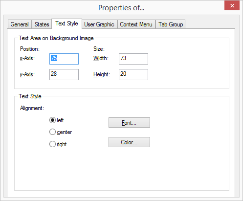
The “Text Style” Tab
The properties of the button text are defined on this tab.
To define the text for a button
1 The position of the area used for text within a button is defined in the fields “x-Axis” and “y-Axis” located under “Position within Area”. The zero point of the coordinate system lies in the upper left corner of the button background graphic.
2 The size of the area used for text is defined in the fields “Width” and “Height”.
3 Then, under ”Text Styles”, select an alignment option:
left: The text is shown aligned to the left
center: The text is shown centered
right: The text is shown right justified.
4 Click on ”Font…” to select the font to be used for the text.
5 Click on ”Color…” to select the color to be used for the text.
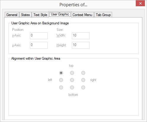
The “User Bitmap” Tab
If the system administrator allows this in Skin definition, every user can define his own graphics and/or individual texts for certain types of buttons (Speed Dials, Shortcuts). In doing so, the Skin itself is not edited.
If you have allowed the display of a user-specific image on this button on the “General” tab, then you define the properties for this graphic on this tab.
To define the properties of an image which has been assigned to a button by the user
1 The position of the area used for the graphic within a button is defined in the fields “x-Axis” and “y-Axis” located under “Position within Area”. The zero point of the coordinate system lies in the upper left corner of the button background graphic.
2 The size of the area used for the graphic is defined in the fields “Width” and “Height”.
3 The alignment of the graphic within the defined area, if it is smaller than this defined area, is activated by option under “Alignment within User Graphic Area”.
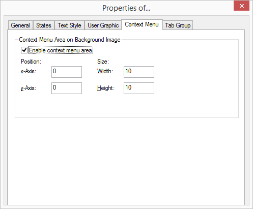
The "Context menu" Tab
You can normally call up the context menu on specific keys by clicking with the right mouse button. You can specify on the "Context menu" tab that on a specific area of a button it is possible to call up the context menu with a single click of the left mouse button.
To define the properties for the context menu
1 If you want to use the context menu, activate the checkbox "Enable context menu area".
2 Enter the coordinates for the area in which the context menu should be available.
You cannot use a separate background image for the context menu area. If you want to highlight the area graphically, you have to make appropriate changes to the background image for the button.
If you move the mouse pointer on a skin over an area for which a context menu was defined, the mouse pointer changes accordingly. Click with the left mouse button to open the context menu for this button.
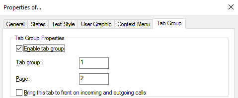
The “Tabs” tab
You can group skin elements on tabs. You must give the information on the group and page for each element that is to be positioned on a tab.
Before you assign the group and page information for the tab for individual skin elements, you should first create the tab elements with the group and page information.
 Key function (type)
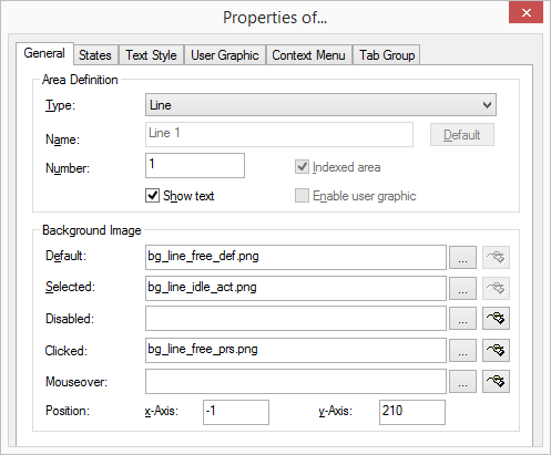
 Click on to search for the appropriate files or
 to edit the selected graphic using the linked graphic application.
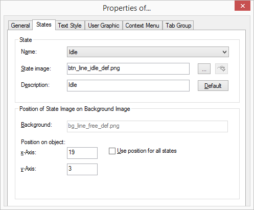