To control the volume, you can define a slider on the Skin. It has a start and an end point, a background picture and a text and a moveable slider that can be designed.
Configuring the Slider
To change the appearance of the slider
1 Click on the slider to be changed.
The "Properties of…" window with multiple tabs will appear.
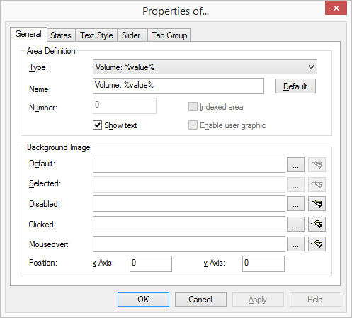
1 In the dropdown list “Type” click on the type of the slider.
2 Enter the text to be used for the label of the button in the “Name” field.
3 If you would like to display the name of the slider on the interface, activate "Show text".
4 The graphic file to be used as the display background is defined in the “Normal” field located under “Background image”.
Click on to search for the appropriate files or
Click on to edit the selected graphic using the linked graphic application.
5 Under “Position”, in the “x‑Axis” and “y-Axis” fields, you can define the coordinates of the slider within the SwyxIt! Classic interface. The zero point of the coordinate system lies in the upper left corner.
It is not possible to change other fields for the slider.
The “States” Tab
The slider can have different states depending on which output is to be regulated (e.g. the volume of the handset, headset or ringing). The slider can be assigned an image (BMP file) or an animation (AVI file) for each of these states.
To define the state properties for a slider
1 Open “State” and click on the “Name” drop-down list.
All available states are listed here.
2 The graphic file or the AVI animation to be used for the state of the slider is defined in the field “State Image”:
Click on to search for the appropriate files or
Click on to edit the selected graphic using the linked graphic application.
For formats that don't support transparency, the color of the upper left pixel of a graphic or an AVI animation is interpreted as a transparent color. This means that the background will show through all areas of the picture which have these colors.
3 Enter a short help text for the QuickInfo in the ”Description” field. This QuickInfo appears when you move the mouse pointer over the respective button.
4 Click on ”Default” in order to resume using the default text (standard) for the description.
5 The coordinates of the graphic or AVI file to be displayed within the button are defined under “Position of State Image on Object” in the “x-Axis” and “y-Axis” fields. The zero point of the coordinate system lies in the upper left corner of the button background graphic.
6 Enable the option ”Use position for all states” in order to use the position entered under ”x- and y-Axis” for all of the graphic or AVI files assigned to states.
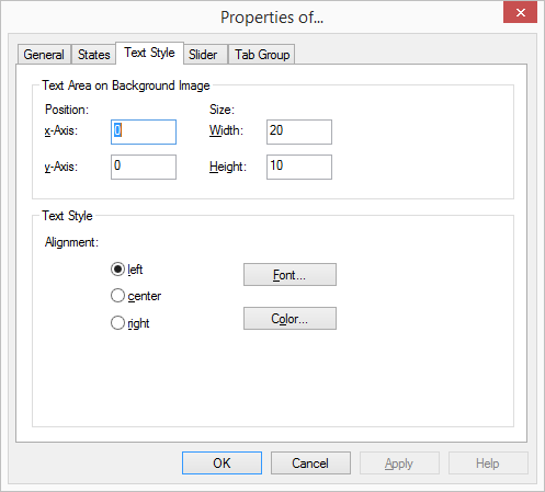
The “Text Style” Tab
The properties of the button text are defined on this tab. This tab is only configurable if the checkbox "Show text" is activated on the "General" tab.
To define the text style for a slider
1 The position of the area used for text within a button is defined in the fields “x-Axis” and “y-Axis” located under “Position within Area”. The zero point of the coordinate system lies in the upper left corner of the button background graphic.
2 The size of the area used for text is defined in the fields “Width” and “Height”.
3 Then, under ”Text Styles”, select an alignment option:
left: The text is shown aligned to the left
center: The text is shown centered
right: The text is shown right justified.
4 Click on ”Font…” to select the font to be used for the text.
5 Click on ”Color…” to select the color to be used for the text.
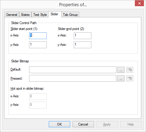
The "Slider" Tab
The properties of the slider are defined on the "Slider" tab.
To define the properties of the slider
1 The beginning and end position of the slider range is defined under "Slider Control Path" in the fields "x-Axis" and "y-Axis". The zero point of the coordinate system lies in the upper left corner of the background graphic.
2 Under "Slider Bitmap" you can define the appearance of the button to be moved over the slider range. You can select from two different pictures here, one for the idle state and a presentation for the "pressed" state of this button.
3 With "Control point on the slider bar" you define the exact position of the point that is interpreted as a hot spot within the slider button.
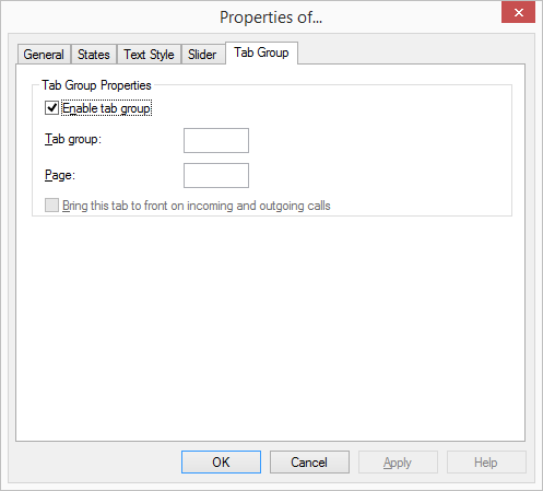
The “Tabs” tab
You can group slider elements on tabs. You must give the information on the group and page for each element that is to be positioned on a tab.
Before you assign the group and page information for the tab for individual skin elements, you should first create the tab elements with the group and page information.
 Click on to search for the appropriate files or
 to edit the selected graphic using the linked graphic application.
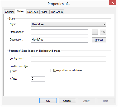